
Story
The ViralMango Creator Marketplace is a platform where nano and micro creators can discover and participate in brand campaigns, with each campaign receiving up to 500 applications per day. It's a place where content, nano/micro influencers can collaborate with brands and build long-term partnerships.
Duration:
Dec 2021 - 2022
Team Members:

My contributions
Research & Insights
Our marketplace's global problems:
- Brand-Influencer communication gaps
- Out-platform collaboration
- Brand-creator right matchmaking
Competitor Flow Audit:
To validate the new design direction for the ViralMango Creator Marketplace, I conducted a structured competitor UX audit focused on key competitors.
Objective:
Understand how other platforms are structured: onboard brands, the campaign creation process, management, communication, and campaign tracking.
Process Overview:
- Identified Key Competitors
- Mapped User Flows
- Categorized Screens
- Compared UX Decisions
- Synthesized Insights
What We Learned?
Through our competitor research and internal UX review, we detect two major issues:
Marketplace Poor Experience
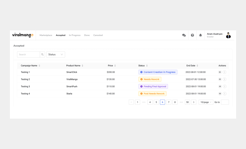
Our current creator marketplace had usability challenges that made onboarding, search campaigns, and application tracking especially challenging in the "Content Creation in Progress" status.
Brand–Influencer Communication Gap
A recurring challenge across both our platform and competitors is the lack of reliable communication between brands and influencers. For example, brands often reach out to creators but receive no response. This isn't just a product-specific issue; it’s a market problem that most platforms struggle to solve.
Collaboration Outside the Platform
We discovered that many brands and creators move their communication and deals to social platforms (e.g., Instagram DMs), bypassing the platform entirely.
It creates serious risks for us: "Loss of control and visibility", "Missed transactions", "Broken campaign workflows", "Decreased platform value".
Despite efforts to solve this problem and emphasizing in-platform communication, behavior did not change significantly. This insight pushed us to reconsider how we approach engagement and retention, not just through features, but through behavioral design and trust mechanisms.
Context
I was tasked with improving the brand campaign creation process to make it more intuitive, efficient, and aligned with user expectations. I have redesigned the campaign management flow and started usability testing on real users(brands) see the Figma link below.
Problem
Our Approach
Key Features I Designed to Test
Outcome
Old version of brand campaign creation, and management flow
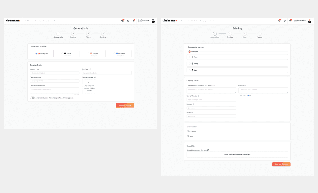
Redesigned version of brand campaign creation, and management flow.
Design System & UI Kit
Interface
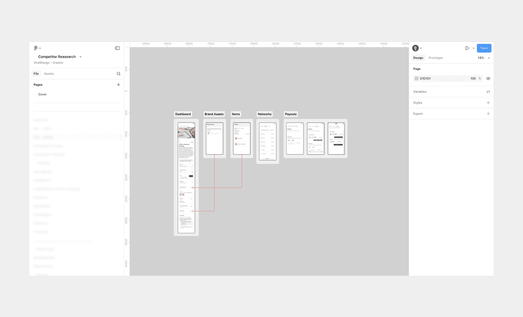
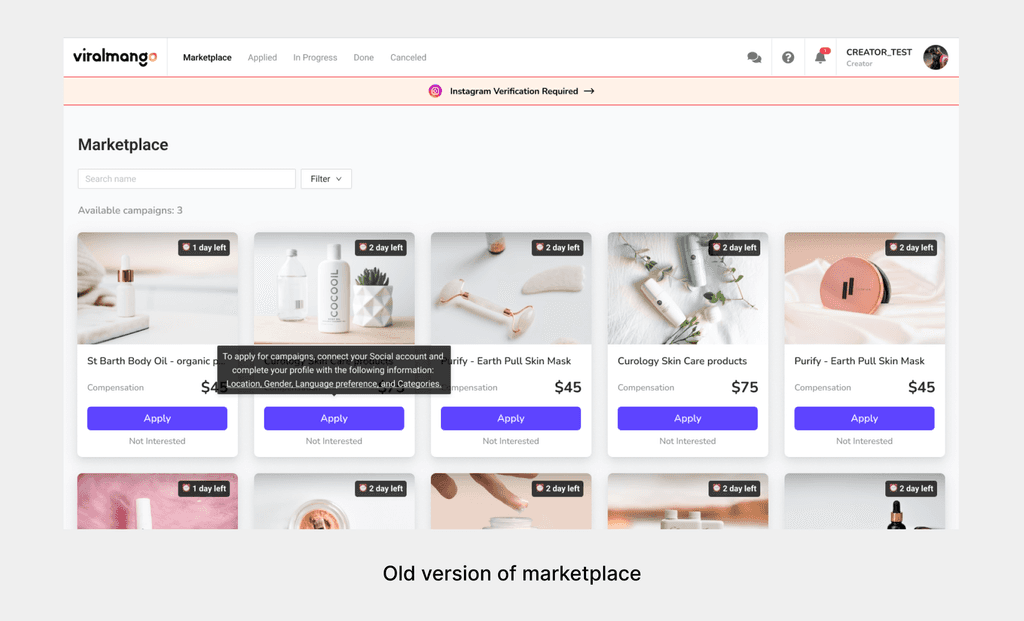
Creator Marketplace
After user insights and data analyze, we decided to change the marketplace page. We made changes step by step.
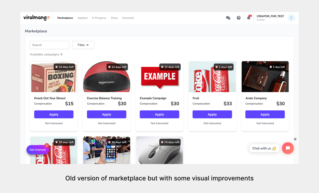
Marketplace design change log
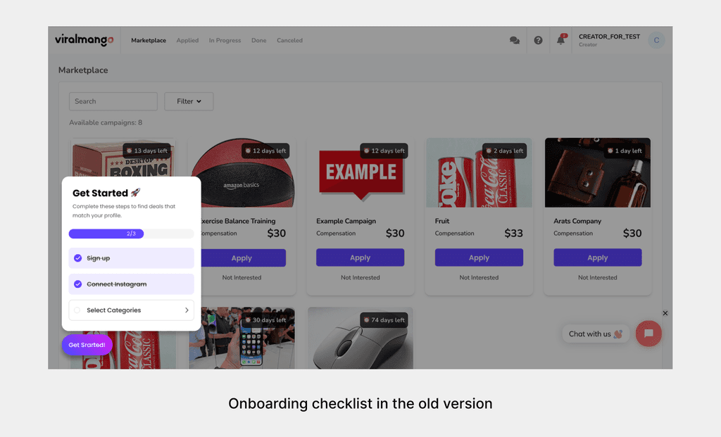
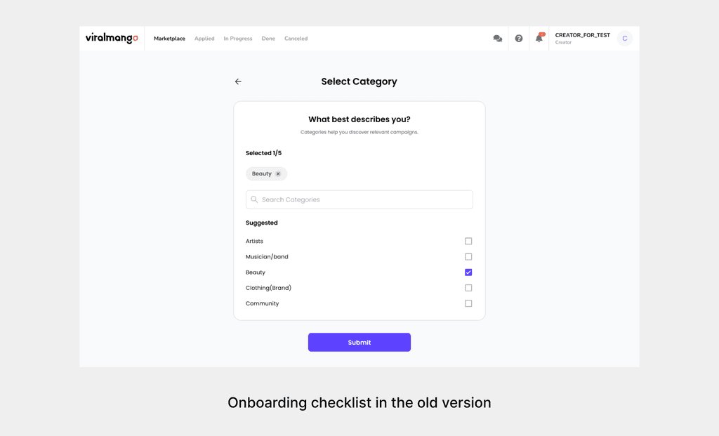
Onboarding checklist in the old version
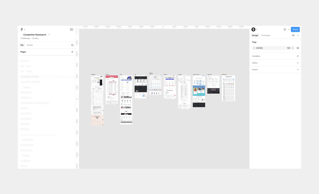
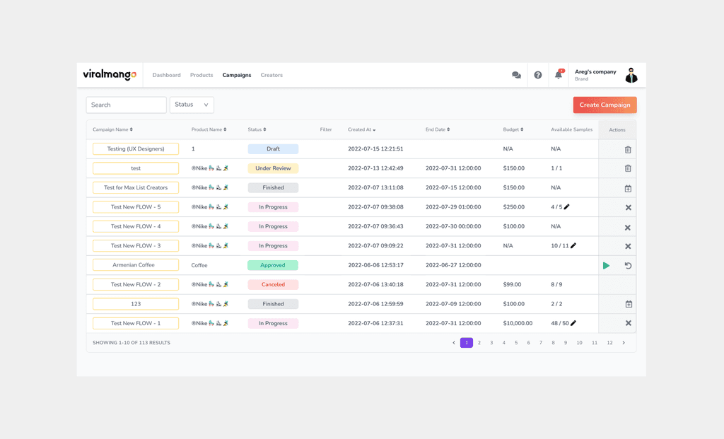
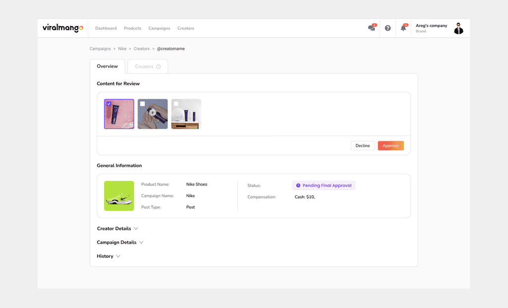
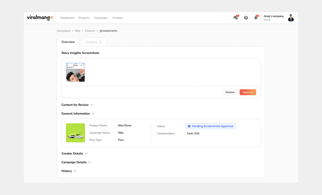
Campaign Management
There were many technology blocks because the main product is built on Tailwind CSS, and the design team had problems working with components and making global changes on the campaign management system. After the same changes, we decided to redesign the old product: phase by phase
For example:
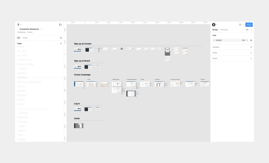
We redesigned the flow by flow on the creator side. The old version was supported, but the new version has replaced it step by step.
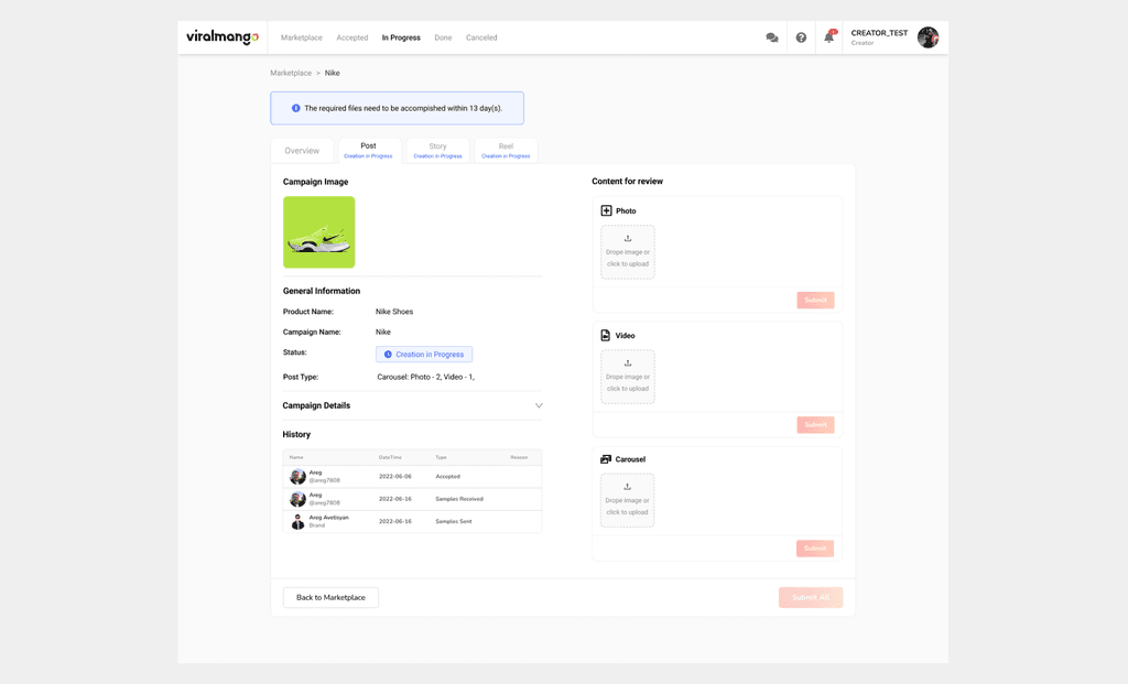
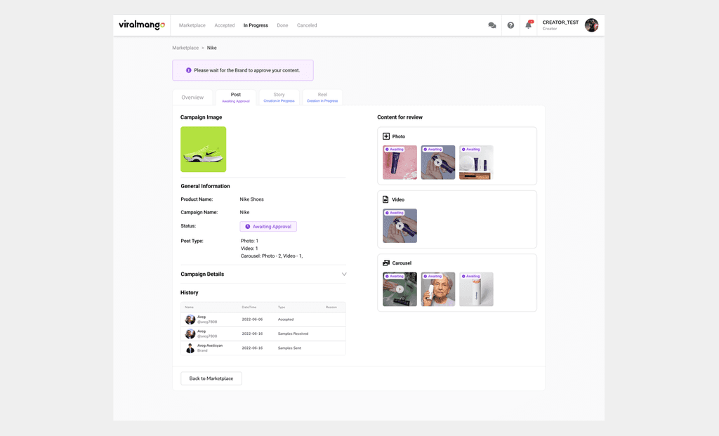
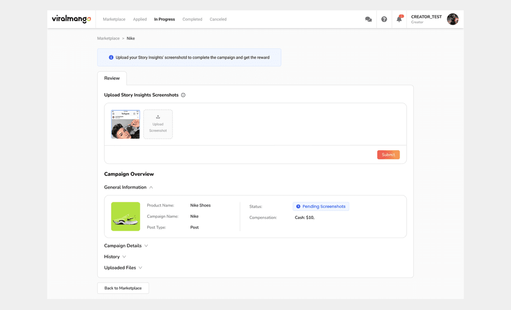
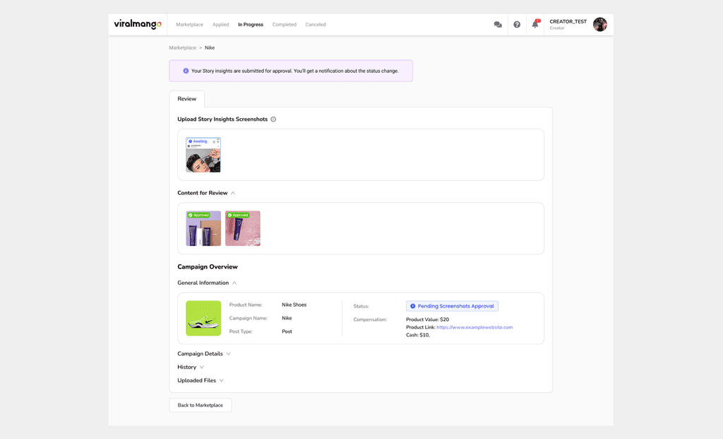
Old creator campaign management flow
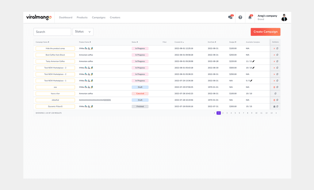
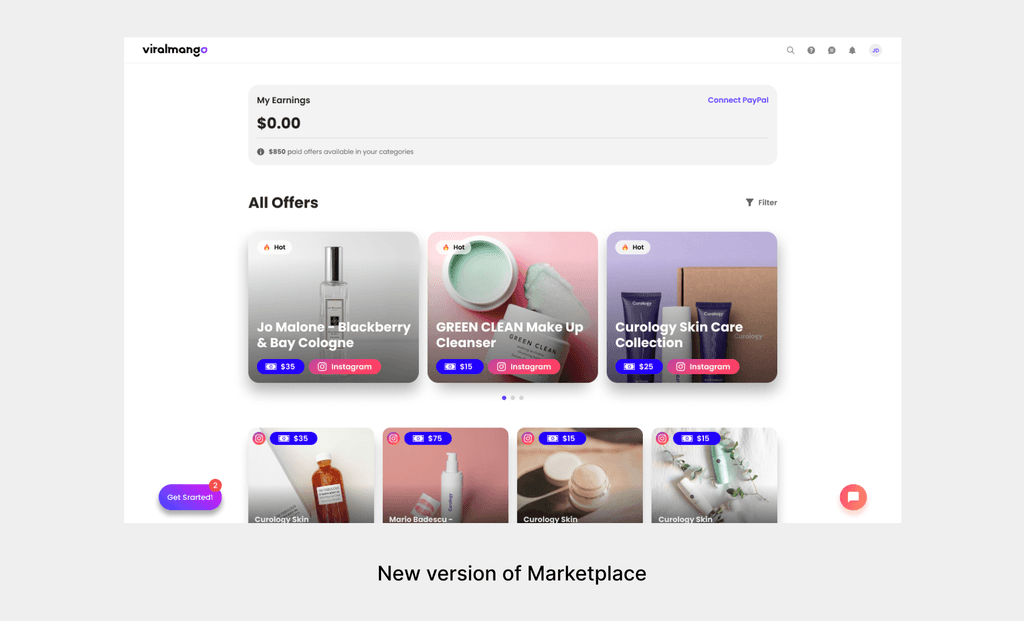
Redesigned version of Creator Marketplace
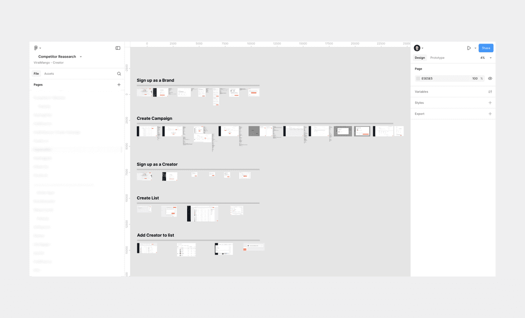
In competitive analysis, we understand that most marketplaces are created for desktop-first. After a lot of user testing and interviews, and our data analysis, we created the new version of the mobile-first creator marketplace design.
Redesigned version of creator marketplace and campaign management.
Testing Insights
Key understandings
We created the new onboarding, which showed a 20% performance. We understood that we made the right decision to change it to a new technology to increase our marketplace experience and open new opportunities for our team to grow the product.
We had a big market problem, which is brand and creator right matchmaking and communication:
- Most brands can't find the right creators for their campaigns.
- Most of the creators don't respond to the brand's deals and can't finish their tasks by the correct deadline.